



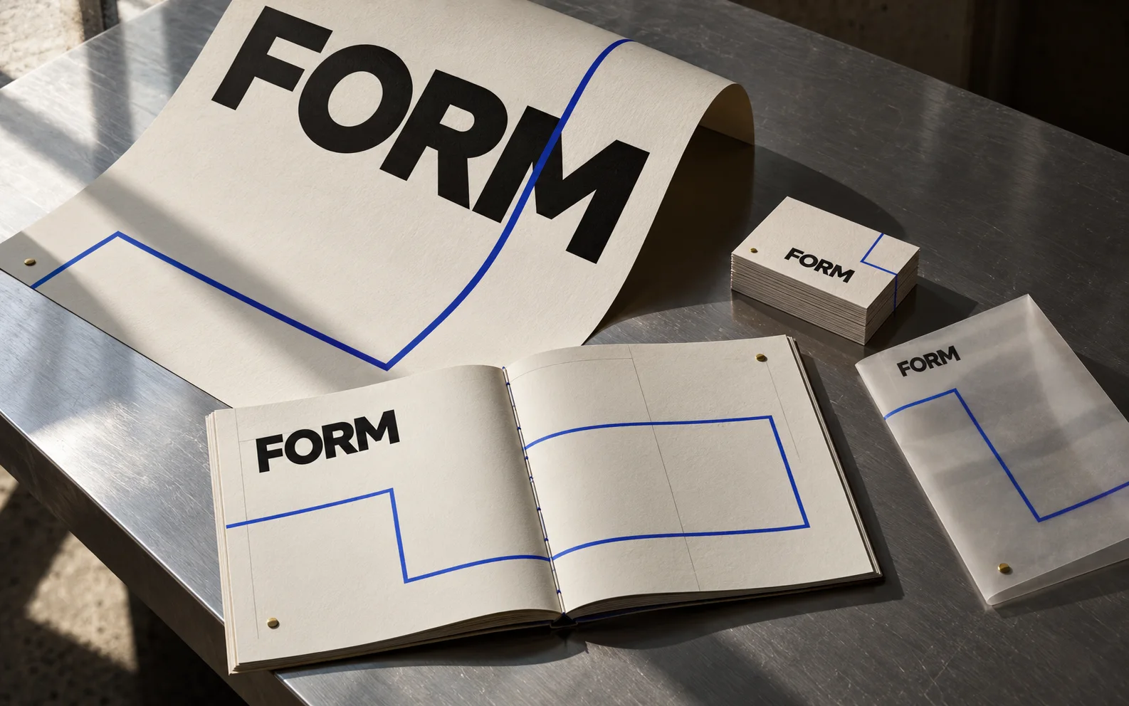
 Original studio concept, not a real client
Forma
Studio concept: A brand is hard to judge when type and motion live in separate samples.
The thesis
Typography and motion as a single language.
The imagined problem
A brand is hard to judge when type and motion live in separate samples.
The creative direction
The studio put type and motion in one visual language. It is not a commercial client and it reports no recognition.
The system
- A type system for the concept
- Motion used as part of the same language
- A visual study, not a campaign
A visual language, in use.
Three illustrative applications of this studio concept. No client campaign or commercial result is implied.
One identity. Many expressions.
Where it could apply
- Poster, book and cards coordinated
- A brand that moves with the same voice
How it was made
Original visual study, not a campaign: no client and no measure of recognition.
What it shows
That typography and motion can be designed together, not in separate samples.
See the offerExplore the lab ↗Want a similar idea? Write to us ↗
This project explores a design and interaction approach. It is not a commercial result for a client, and it does not state metrics or performance that were not measured.
Possibilities begin with a conversation.
A new idea. A problem to solve. A project to grow.